Style Tile
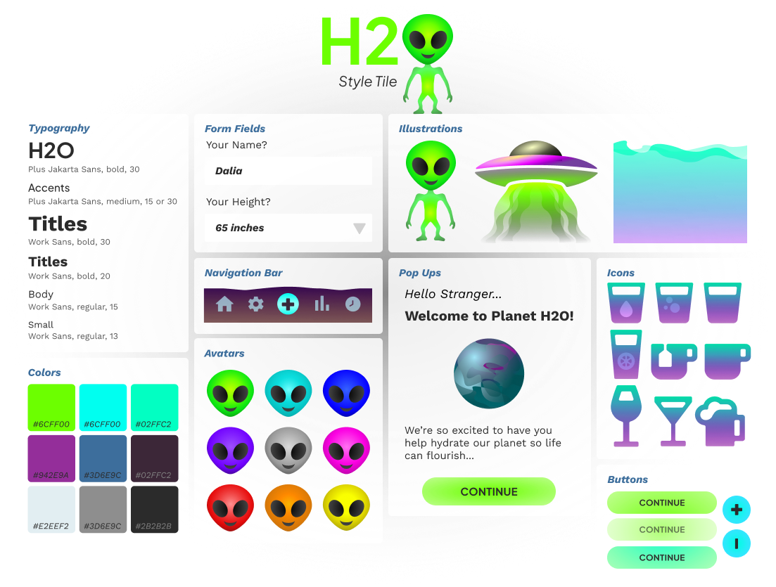
Taking inspiration from health and hydration apps and early RPG games, I created a fun and clean UI. The name and logo are a play on H2O / UFO. I picked a palate that was bold and would work on dark backgrounds since it would be on dark form to be more in line with the concept of space. Since there would be so much color visually to look at and there are text heavy parts of the app, I kept the font simple, easy to read, but on brand.
![]()
Taking inspiration from health and hydration apps and early RPG games, I created a fun and clean UI. The name and logo are a play on H2O / UFO. I picked a palate that was bold and would work on dark backgrounds since it would be on dark form to be more in line with the concept of space. Since there would be so much color visually to look at and there are text heavy parts of the app, I kept the font simple, easy to read, but on brand.