NY AQUARIUM
A Responsive Website Redesign
Background
The New York Aquarium, as part of the larger group of institutions owned by the Wildlife Conservation Society (WCS), engage visitors with ocean fun, education, and experiences.
Their commitment to connecting New Yorkers to ocean wildlife at the Aquarium has never wavered since their inception in 1896. They are in need of a website re-design that is responsive and better engages their visitors and members. As part of their growth to consistently better serve their visitors and conservation education and goals, they have decided to overhaul their web design and presence.
Challenge
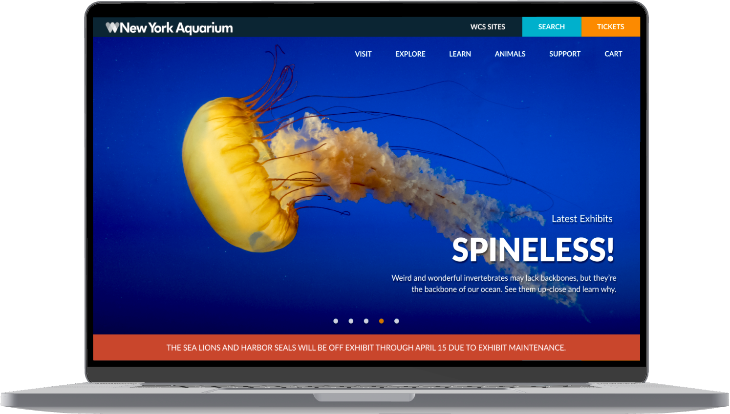
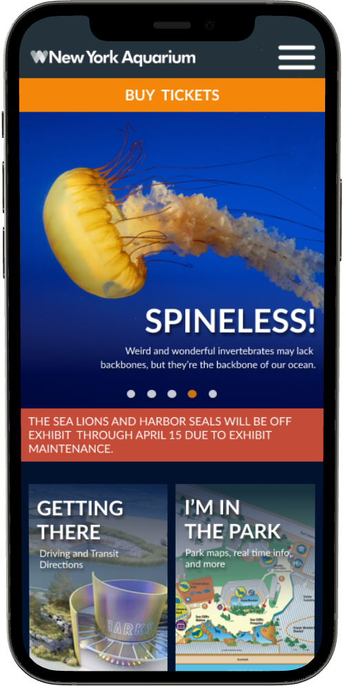
A responsive website that covers core functionality: planning a visit to the museum, membership, and special exhibitions. Extend or improve consistent UI across the site and add update homepage to draw in site users / visitors.
Process
Empathy > Define > Design > Prototype > Test > Iterate > Reflect
The New York Aquarium, as part of the larger group of institutions owned by the Wildlife Conservation Society (WCS), engage visitors with ocean fun, education, and experiences.
Their commitment to connecting New Yorkers to ocean wildlife at the Aquarium has never wavered since their inception in 1896. They are in need of a website re-design that is responsive and better engages their visitors and members. As part of their growth to consistently better serve their visitors and conservation education and goals, they have decided to overhaul their web design and presence.
Challenge
A responsive website that covers core functionality: planning a visit to the museum, membership, and special exhibitions. Extend or improve consistent UI across the site and add update homepage to draw in site users / visitors.
Process
Empathy > Define > Design > Prototype > Test > Iterate > Reflect
Role
UX / UI Designer
Interaction Designer
UX Researcher
Tools
Figma
Maze
Zoom
Duration
80 hours
UX / UI Designer
Interaction Designer
UX Researcher
Tools
Figma
Maze
Zoom
Duration
80 hours
1. EMPATHY
The research goal focused on finding out how to best engage users on the NY aquarium site to keep them interested and provide a stress free experience planning their visit.
Objectives
- Understand why users visit the public institution websites
- Understand what users most want, need, and are excited to see on the site
- Understand what users are drawn in by and lead them to browse
- Understand how to better organize site information
Process
- Competitive Analysis
- User Interviews + Contextual Inquiry
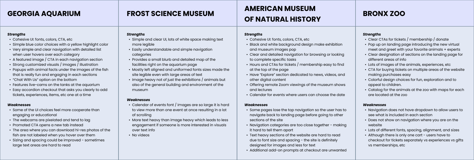
Competitive Analysis
Public institution websites benefit from establishing a good balance of practical planning and fun engagement. This is most successful when exploration begins for the user on the site with the exhibitions before the actual visit, with features live cams, facts, and other media. Offering digitals experiences is also important during Covid when in person visits have been cut down significantly.
Easily accessible and upfront practical information like maps, hours, ticketing rates is important for easy planning. Since these institutions usually have a lot of dense, text heavy information, the navigation must be clear and easily understandable. The most successful checkout flows were usually broken up for the user in some way - i.e accordion forms - to make choices more manageable.
Top Strengths
- Offering virtual exporation before in person visit
- Easy navigation
- Clear and simple checkout
Top Weaknesses:
- Undigestable heavy text
- Hard to navigate around to needs
- Low quality media
User Interviews
+ Contextual Inquiry
I recruited participants to learn about their expectations for visiting the NY Aquarium and it’s website, their current experience with the site, and what they would like to see or improve in a redesign version. I asked them open ended questions and had them perform a few tasks on the current website: explore the site offerings, navigate to exhibitions and animal encounters, and purchase tickets.
- Method: combo of in person and remote via Zoom
- Participants: 6
- Age: 23 - 38
Findings
- Users are looking for clear navigation, transparent checkout process, and easily accessible practical info
- Users enjoyed strong visuals and interactive features like educational facts and live cams
Findings
- Users wanted a consistent UI for the entire website
- Users wanted to be able to plan their visit easily and be excited by what they wanted to see at the aquarium
